How much does a book cover factor into your reading choice?
It’s the first draw, right? (Forgive the artsy pun.)

Mark D. Ford, Senior Art Director
WaterBrook Multnomah Publishing Group
Today’s guest isn’t an author. But as the Senior Art Director at WaterBrook Multnomah Publishing Group, Mark D. Ford is a key member of my publishing team.
MONA: Mark, thanks so much for joining us on Hindsight today. We’d like to hear about your journey as an artist. Who most influenced your pursuit of art?
MARK: I was most inspired to be an artist by my father, a career Air Force officer. Although he was an administrator, he had a creative side. I loved to watch him sketch familiar cartoons. He even created a family logo and crest with our own motto: “Never Tease a Weasel.” The six of us kids were the weasels. I was the number three child–the rebellious one. Following my father’s lead, I’d draw cartoons endlessly, my favorite being Bugs Bunny. I even created my own comics.
Ironically, when it came time to choose a college path, my father directed me away from Art, toward a more serious degree—Business Administration. It may have been more about where a football scholarship would take me. With six kids in the family, I needed the financial help to get through college. After graduating, without a clue what I wanted to do, I chose the excitment of the Air Force, and became a navigator in B-52 bombers. Six years later, unhappy with my career path, I left the Air Force to give a career in Art a chance.
About that time, I came across an article in Newsweek magazine, I believe. One of those “Top Ten Careers of the Next Decade” kind of articles. I read a profile of a guy who designed book covers for a living. I knew immediately that was it, and I enrolled in a local college for a degree in Graphic Design.
MONA: What training and/or experience brought you to your current position at WaterBrook Multnomah?

Out take from Two Brides Too Many photoshoot.
MARK: I was raising a young family, so I knocked out a degree quickly and landed my first design job at a scale manufacturing company. The scales you see in the supermarkets that weigh your fruits and veggies. I designed the scale dials, packaging, catalogs, and advertising.
MONA: Whew! What a relief to hear you were the designer for veggie scales, and not the kind doctors make us step on.
So . . . what happened next?
MARK: As soon as I could, I left there and found my first publishing job with a magazine that served the Christian marketplace. For five years, as I grew in my skillset, I watched thousands of products being pitched and presented in our magazines every month. Again, I was drawn to books. When a new publisher, WaterBrook Press moved to town, I jumped for a shot at a Designer position.
MONA: How long have you been with WaterBrook Multnomah?

Another Out Take
A box helped even out the models’ heights
MARK: I took the job offer as Senior Designer. Nine months later I became the Senior Art Director, running the Art Department. That was twelve years and several hundred books ago. Since then, we acquired another publisher, Multnomah Books, and together produce 70-100 frontlist books a year.
MONA: What is your artistic process for designing the book cover for a novel?
MARK: I enjoy the great variety of books for which we get to design covers. I would approach a nonfiction, self-help book much differently than an historical fiction title. And within fiction, a romance novel presents different challenges than a suspense thriller or YA (young adult) fantasy title.
Having said that, I still will often go to a sketch book and scrawl out a few quick ideas. Often, so sketchy only I could interpret it. Other times, I’ll do a tighter sketch to figure out placement and balance of items. But the computer is a great tool, and just as often I’ll jump in and start pulling elements together, usually in Photoshop. In either case, it’s preceded by doing some research on the book’s content, storyline, characters, etc., and coming away with some solid directions to pursue.
At WaterBrook Multnomah, we have a concepting meeting early on to meet with folks from Editorial, Marketing, and Sales. That launches our creative process. In the meeting, we discuss how to direct the book’s cover design, considering things like target audience, demographics, competition, and of course, author input!
MONA: Great answer, Mark, especially that last bit.
What mediums are used most in cover design for today’s marketplace?

An early composite for Two Brides Too Many
MARK: Cover design is taking place these days primarily using layout programs like Adobe InDesign, importing imagery from Photoshop and Illustrator–you can get all three by purchasing Adobe Creative Suite. Photoshop is a great tool, and original and stock photography are brought into Photoshop for touch up and manipulation. Often, multiple images are combined to bring about an overall effect that often times has to be ultra-dramatic to compete on the bookshelves. I think I counted about a dozen images that went into a recent fiction cover image I created for Liz Curtis Higgs.
MONA: What is your typical focus when thinking about the imagery for a cover? Setting? Characters? Theme?

A second composite for Two Brides Too Many
MARK: We’ve got to be accurate with the story elements on the cover. I’ll watch my wife reading one of our novels while flipping back to the cover repeatedly, and she’ll let me know if it doesn’t match the story. I often like to leave more to the imagination, having more vague imagery on the cover. But, the trend lately in Christian fiction has been to be more literal, showing a full face character, capturing a setting, and even timeframe on the cover. So, we pay a lot of attention to that as we’re developing the scene.
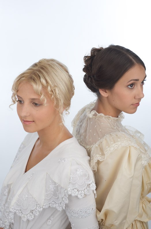
MONA: Mark, you designed the cover for Two Brides Too Many and worked with Kelly Howard on the cover for Too Rich for a Bride. You’ve been involved with a lot of book covers since then, but do you recall any specifics from the design process for Two Brides Too Many?
MARK: Working on Two Brides Too Many was a lot of fun for me. It was great to feature the local history of Cripple Creek, Colorado, just over the hill from us.
I knew I wanted to capture the feel of an Old West mining town with the Sangre de Cristo mountain range behind it. The tricky part was capturing the two sisters in a dynamic way. With this title, it seemed obvious to have the sisters both wearing wedding dresses on the cover.

Book 1
The Sinclair Sisters of Cripple Creek Series
I had found a couple of stock photo images of brides that I “photoshopped” together on the cover. I submitted this composite and got approval to go ahead with a photoshoot. We often have to do a “preview comp” so people can see what the finished product will look like before going through the expense of a photoshoot. We found a company, Oregon Shakespeare Festival, that rents 18th and 19th century costumes, and had two antique wedding dresses shipped to us for the photoshoot. Then we needed models. Through a talent agency in Denver, we found two girls who fit our character descriptions. “Kat” ended up being quite tall compared to “Nell,” which we remedied by having Nell stand on a box for the back-to-back shot.
I was a little nervous about the rental dress fitting Kat, so I brought my wife’s wedding dress as a backup. Julie, my wife, had her great-grandmother’s dress (circa 1865) completely remodeled for our wedding in 1985. We brought it along to the shoot, just in case. Turned out to be a good idea because the rental didn’t fit at all. Julie is 5’ 0” and Kat is 5’ 10.” Somehow we Julie’s dress work! As you can see from the finished product, we captured the Sinclair sisters’ personalities and attitudes. Our models did a great job.
Side note: My intention was to leave a little more to the imagination by cropping both girls just below the nose, but because their expressions were so captivating, we decided to show their full faces.
MONA: Mark, the cover choices you and the team made were spot on. Our Sinclair Sisters fans are captivated by the cover’s historical warmth and the girls’ intriguing expressions, as am I.
I’m remembering a story about one of the models and the flowers staged for the shoot.

A fun Out Take from the end of the photoshoot
MARK: We try to have fun on the set and after we shot a second option, basically a close up shot of the dress with the model holding flowers, we tried some different ideas. In one shot, we had Nell tossing the bouquet toward the camera while we tried to capture the roses mid-flight. You can only do this for a few takes before the roses begin to disintegrate. So we had a little game of pitch, shoot, and catch. Took some great shots—which we didn’t use, but we did end up using one of those dress shots for the cover of Too Rich for a Bride.
MONA: Sounds like fun.
Book genres seem subject to cycles. For instance: Not all that long ago historical fiction was a hard-sell. Not it’s “hot.” Are there also cycles in cover design?

Book 2
The Sinclair Sisters of Cripple Creek Series
MARK: In the twelve years I’ve been here at WaterBrook Multnomah, I have seen styles come and go. With the advent of Photoshop, it became much easier to composite images in a realistic and even hyper-realistic way. So, illustrated covers suddenly looked dated on fiction titles. I think we’ll start seeing that swing the other way soon. In Christian fiction, we’re seeing characters full face and large on the cover. I think that trend will shift in favor of more anonymous, vague characters presented on the cover.
Colors are an interesting challenge. Everybody wants a warm, inviting cover, but we can’t have a list of all orange and yellow covers. So we find ways of making blue and green feel warm.
MONA: What advice do you have for aspiring Book Cover artists?
MARK: Take all kinds of design jobs. They all build your portfolio and experience. And they all have their unique design and creative challenges to solve. I think that’s why we design…we love the creative process.
MONA: Great counsel. Mark, we so appreciate the time you’ve taken to give us a glimpse into your world of book cover design. Regardless of how well-written a book might be, a weak cover can keep it on shelves or warehouses. The careful work you do is critical. Thank you!
In closing, Mark, do you have a Bible verse that especially inspires you as an artist?
MARK: I’m an outdoors person. I like to hike, bike, run, 4-wheel. I have two cars, both are convertibles. I’m inspired by God’s creation, and I experience it everyday living in Colorado.
The heavens declare the glory of God; the skies proclaim the work of his hands.
Psalm 19: 1
Click here to read Chapter One Excerpt,
Two Brides Too Many!
CONGRATULATIONS TO DIANA G, WHO WON A COPY OF TWO BRIDES TOO MANY IN THE MIDNIGHT DRAWING!
Comments 38
Wonderful interview, Mona! Mark, it’s so neat to learn more about the process of cover designs and to see some of the early drafts. Very neat! WaterBrook Multnomah does the most amazing work (and I’m not biased at all) 😉
I too find it fascinating to hear about the process. I love studying the book covers before, during and after reading a book. Thank you for allowing us to peak at your world!
Great interview! I am such a fiction junkie that I’m afraid I’m becoming quite the cover snob! Just yesterday I was in Barnes & Noble, and browsing through their Christian Fiction section, a good 75% of the books looked exactly the same! (especially the Amish ones) Lots of the same colors, same faces, sames poses with similar models…. I almost hate it when cover models are so prominently displayed on the cover, because I like to imagine them for myself! Guess I’m just looking forward to the pendulum swinging back to those more vague styles Mark mentions here. 🙂
Please pick me! Beautiful cover by the way!
Great interview. I am so intrigued by this process, especially since the WaterBrook folk are busy designing the cover of my debut novel. I hope I get to see all these stages too. What a fun subject to post about. My only regret from our visit to their offices last month was that I didn’t request to see where the design team works. Sometimes I dearly miss my art, but writing is my first love now.
MONA: What advice do you have for aspiring Book Cover artists?
MARK: Take all kinds of design jobs. They all build your portfolio and experience. And they all have their unique design and creative challenges to solve. I think that’s why we design…we love the creative process.
Love the final FUN photo!
Too many people only want to take the job that they want in the end…. Not realizing that the road to get there is half the fun just hidden behind the experience. …if that makes sense. 🙂 great interview. [email protected]
Great cover! Would love to win!
I love the fact that he has his wife read the book to see if the picture suits the book. Loved the insight he shared about the process in selecting the cover.
I find it fascinating that he didn’t pursue art when he first went to college. Graduating from college and six years of air force. That shows it’s not too late to pursue your dream.
Campbellamyd at gmail dot com
Great Interview!!! Thanks for the Great Giveaway! God Bless!
I found it interesting the way he comes up with the perfect cover for a book. And, that they would use such different models, if they had to make one look taller than she was for the photo. I found it interesting that he went back to the art. All of my kids were good at drawing, but none pursued it to my disappointment. My son was fantastic of most anything he chose to draw, but loved cartoons. When he won art lessons, and they persuaded him to arcitecture, and tho he was good at it, he lost interest in drawing. Allso one of my daughters was great at drawing faces, which I think is hard, but also stopped. I enjoyed the interview with Mark. Hoping I can win this book. Thanks! Maxie ( [email protected] )
I didn’t realize you used real models sometimes. I guess I assumed you just started drawing and that was it. Never knew so much work went into it, but I really love the covers that have been coming out now, so keep up the good work!
Wow! I’m glad they put a lot of time and effort into selecting the perfect book cover. The cover is defiantly what draws people in! They did a fantastic job!
Great interview! I’m obsessed with books covers and always love hearing more about how they’re designed. I love that he has his wife read the novel and then decide if the cover fits! I’d love to have her job =)
I loved all the details of putting this shoot together. When reading a story I often go to the cover, back to the story, back to the cover. Often, covers look nothing like what I have envisioned from the story.
I didn’t realize the process was SO in depth! Wonderful interview and very interesting to read! 🙂
Hi Mona….
Enjoyed the interview…it fascinates me how they do all the process of making the cover. I would enjoy working there with them. I got to say that I too, just like his wife, tend to look back and forth to the cover when I am reading a book just to see if it has captured the story. To me I think is the cover of the book that gets me more if by looking at it I can sumerize the story on it. Thanks for sharing this with us Mona. Blessings!!!
so interesting please enter me into your drawing
Pingback: Guest: Kelly Howard, Cover Artist for The Bride Wore Blue and Twice a Bride « Hindsight by Mona Hodgson